PROJECT OVERVIEW
The Problem
Accessibility to the art and culture of a city is limited during a public health crisis (COVID-19 pandemic) as well as for those with disabilities, without access to transportation or the Internet, and etcetera.
THE GOAL
Design an app that allows anyone to “visit” a museum through immersive virtual tours.
USER RESEARCH
I conducted interviews and created empathy maps to understand the users I’m designing for and their needs. A primary user group identified through research was retired adults wanting to stay connected with local art and culture.
Research also revealed that other user problems included difficulties with transportation/navigation, lack of accessibility in certain museums, and the steep cost to go to a museum in-person.
PAIN POINTS
ACCESSIBILITY: Museums are primarily designed to be experienced in-person, but those with transportation and accessibility difficulties are less able to visit.
COST: Museum ticket costs are expensive, and in urban areas, transportation costs are an additional burden.
EXPERIENCE EQUIVALENCE: Many of the alternatives to attending a museum in-person lack the same quality of experience and available information.
PERSONAS
USER JOURNEY MAP
STARTING THE DESIGN
PAPER WIREFRAMES
Drawing out what the screens would look like through a typical user flow helped me to consider what would be important to a user and how the information should be organized. It also made it possible to try out different options for layouts/features.
DIGITAL WIREFRAMES
As I continued to iterate the wireframes, I based my design choices on and user research.
LOW-FIDELITY PROTOTYPES
Using the completed set of digital wireframes, I created a low-fidelity prototype. The primary user flow I connected was entering a museum gallery and selecting an artwork to learn more about, so the prototype could be used in a usability study.
REFINING THE DESIGN
MOCKUPS
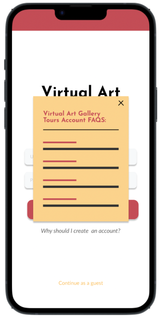
The initial usability test revealed that one feature (creating an account) was met with confusion and reluctance during usability testing. More information and a way to opt out were included in mockups.
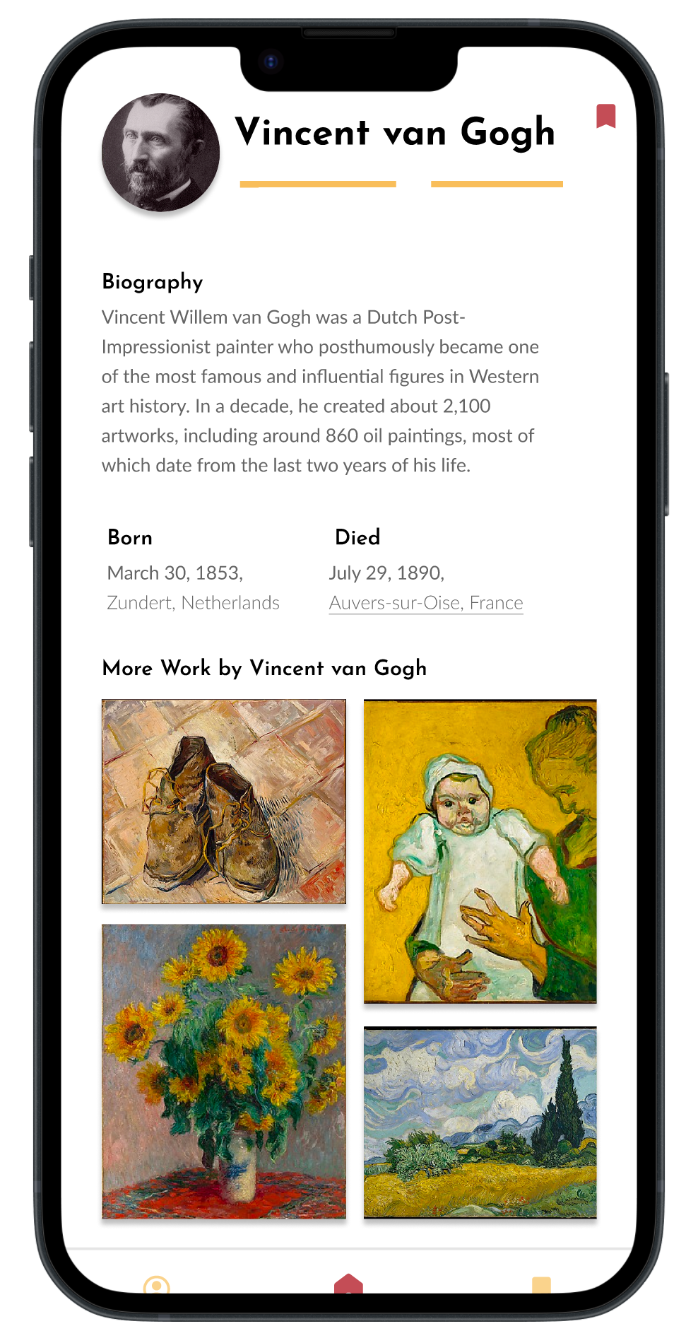
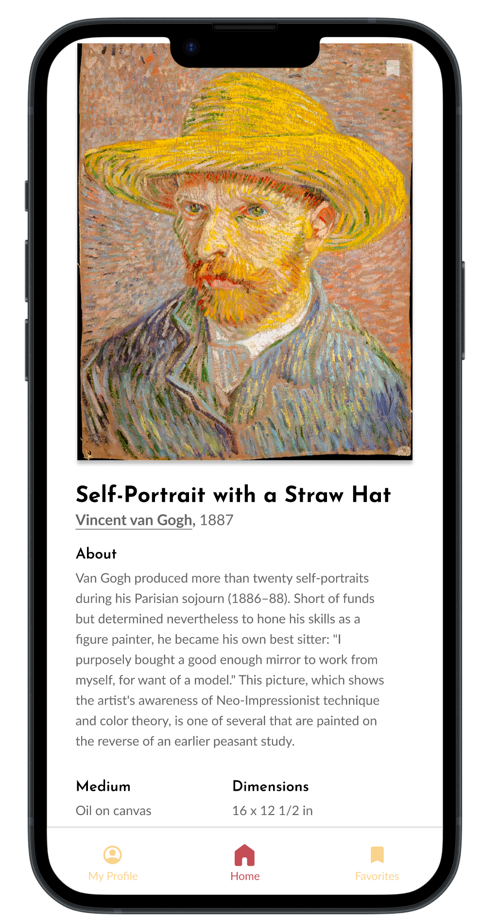
Most users felt that when they clicked a work of art they first wanted information on that work of art with the option to learn more about the artist, instead of the reverse in the low-fidelity prototype.
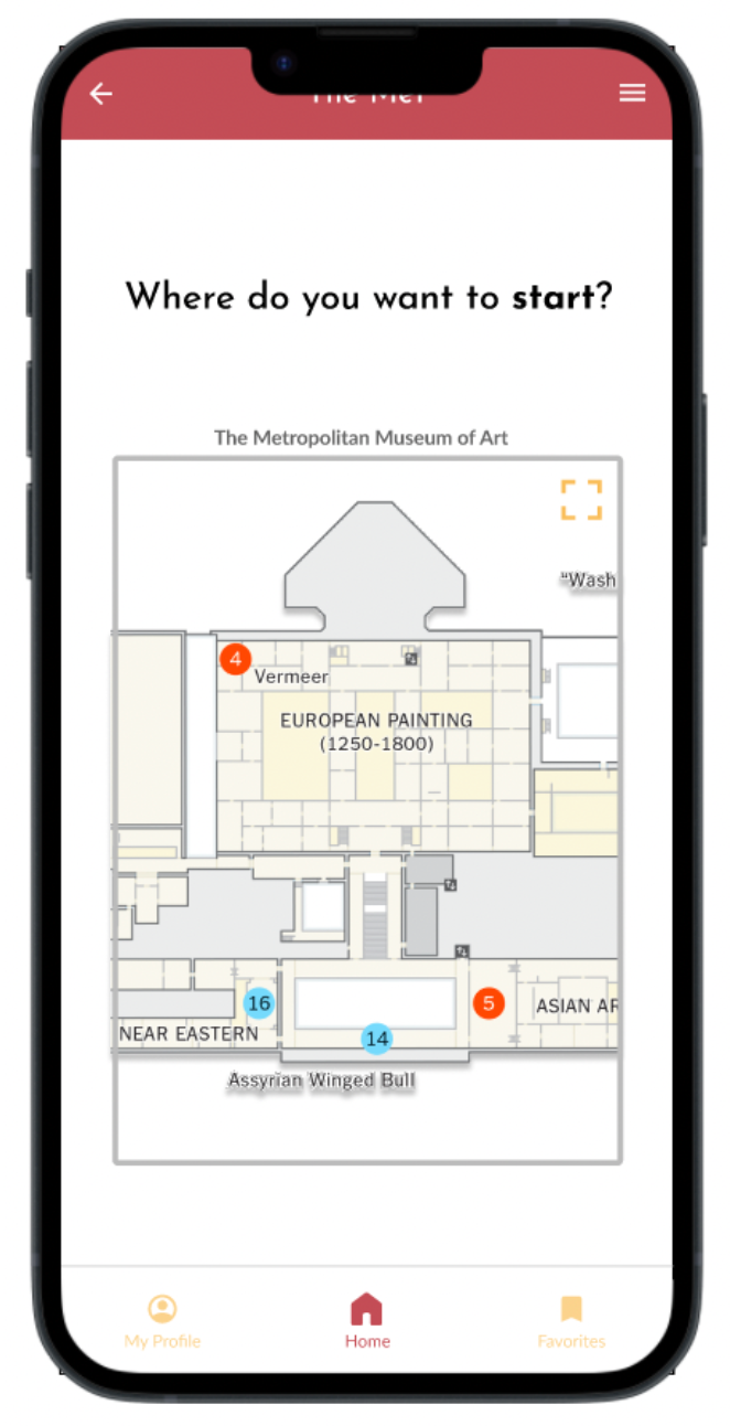
The transition from the floor map into a landscape immersive view was confusing and jarring for users during the usability study, so the updated mockup maintained the portrait view with a way to control when they enter landscape view of the immersive experience.
HIGH-FIDELITY PROTOTYPES
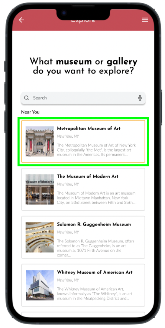
The final high-fidelity prototype presented cleaner user flows for exploring a museum, viewing an artwork, and learning more about its artist
ACCESSIBILITY CONSIDERATIONS
1. Provided access to users who are vision impaired through adding alt text to images and audio-guided tours.
2. Made a physical space virtual to benefit those with physical disabilities.
3. Incorporating keyboard shortcuts as an alternative way of navigating the 3D space.
GOING FORWARD
IMPACT
The app makes users feel like they are able to actively engage with local art without having to physically be in the space.
One quote from peer feedback:
“I love how it has feels like the real museum. It is easier to see and learn more about the art.”
“I love how it has feels like the real museum. It is easier to see and learn more about the art.”

NEXT STEPS
1. Conduct another round of usability studies to validate whether the pain points users experienced have been effectively addressed.
2. Conduct more user research to determine any new areas of need.
3. Incorporate multiple user paths for different art museums so usability tests can be less limited (i.e., one museum, one gallery, one artwork, one artist).