PROJECT OVERVIEW
The Problem
There are significant barriers to obtaining mental health care for first-generation immigrants in the United States.
THE GOAL
Design an website that creates a bridge between first-generation immigrants and access to appropriate mental health care.
USER RESEARCH
My mother was a first-generation immigrant from the Philippines - first to Australia, and then to the United States. From her and my other family who immigrated, I learned firsthand what barriers exist in not only everyday life, but especially in mental health care.
PAIN POINTS
STIGMA: Cultural stigmas around help-seeking and mental health are common. Additionally, institutional distrust (in hospitals or health care providers) can prevent people from seeking out or continuing mental health care.
LANGUAGE BARRIERS: Limited availability of same-language care can be a barrier for immigrants who speak little English or it is their second language.
FINANCIAL BARRIERS: Difficulty in obtaining insurance and/or the high cost of care can be a barrier to immigrants in obtaining mental health treatment.
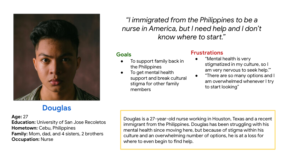
PERSONAS

STARTING THE DESIGN
DIGITAL WIREFRAMES
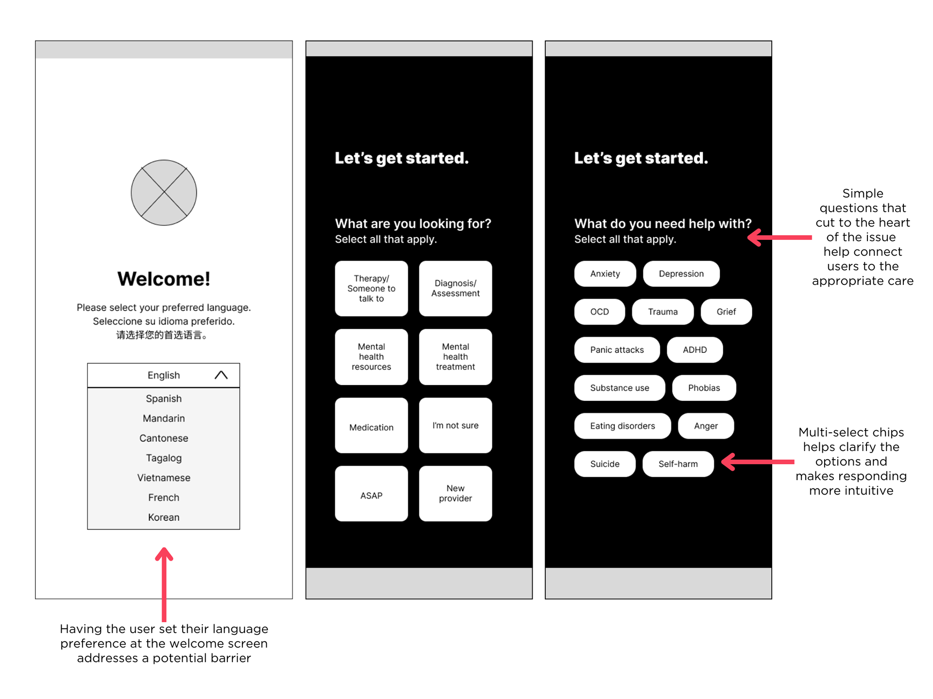
As I continued to iterate the wireframes, I based my design choices on user research. My primary thought was what are the fewest number of questions needed to get at the information.
LOW-FIDELITY PROTOTYPES
Using the completed set of digital wireframes, I created a low-fidelity prototype. The primary user flow I connected was answering simple questions, selecting a provider, and making an appointment.

REFINING THE DESIGN
USABILITY STUDY
AFFINITY DIAGRAMMING
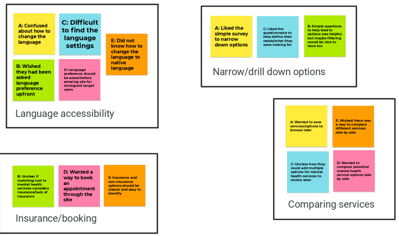
PRIORITIZED INSIGHTS
Priority 0
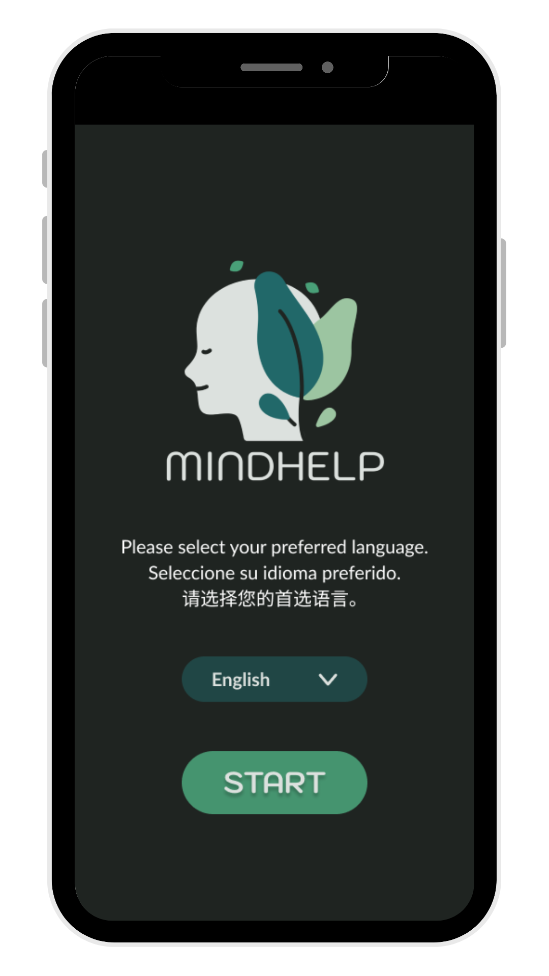
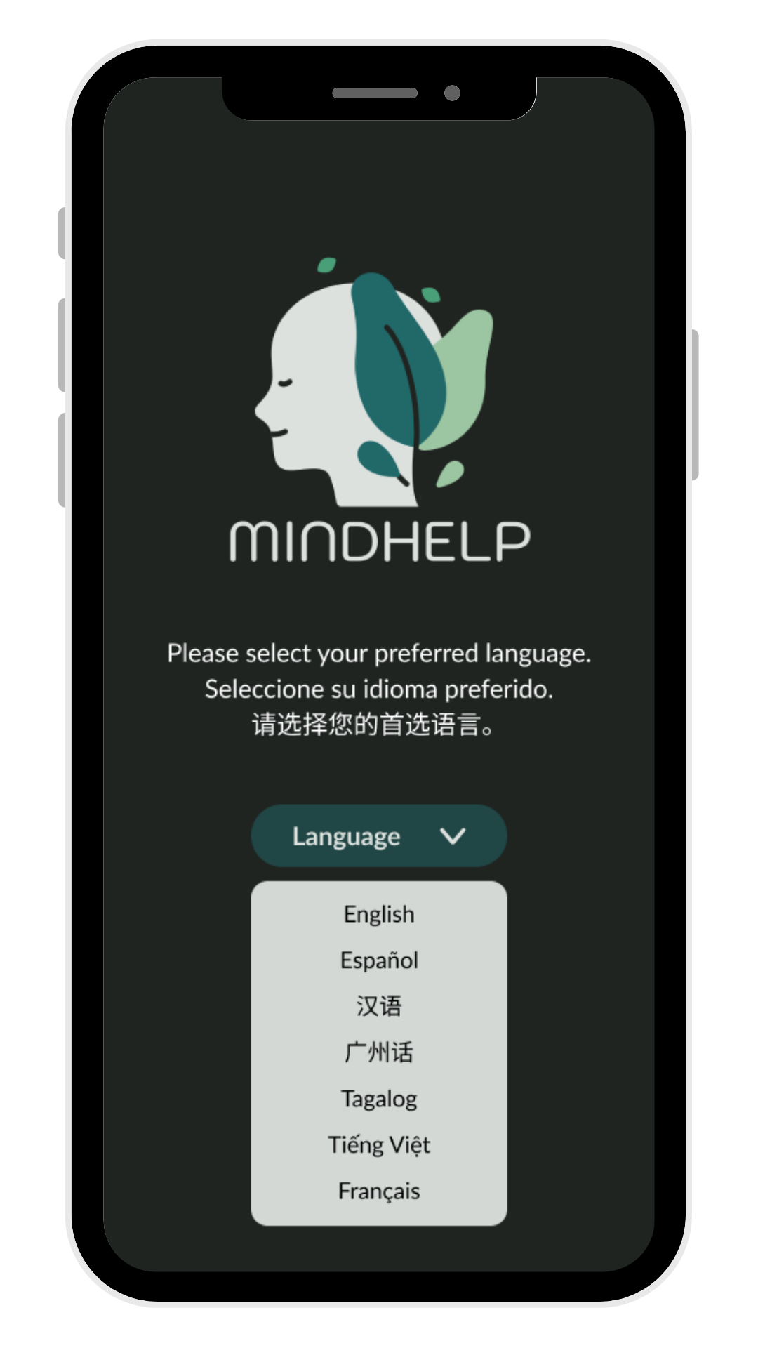
Based on the theme that: for all users, changing the preferred language was unclear, an insight is: users need to be able to select their language preference before entering the site.
Based on the theme that: for most users, the practical flow of finding an in-network provider and booking an appointment with them was unclear, an insight is: the user flow needs to be more straightforward.
Priority 1
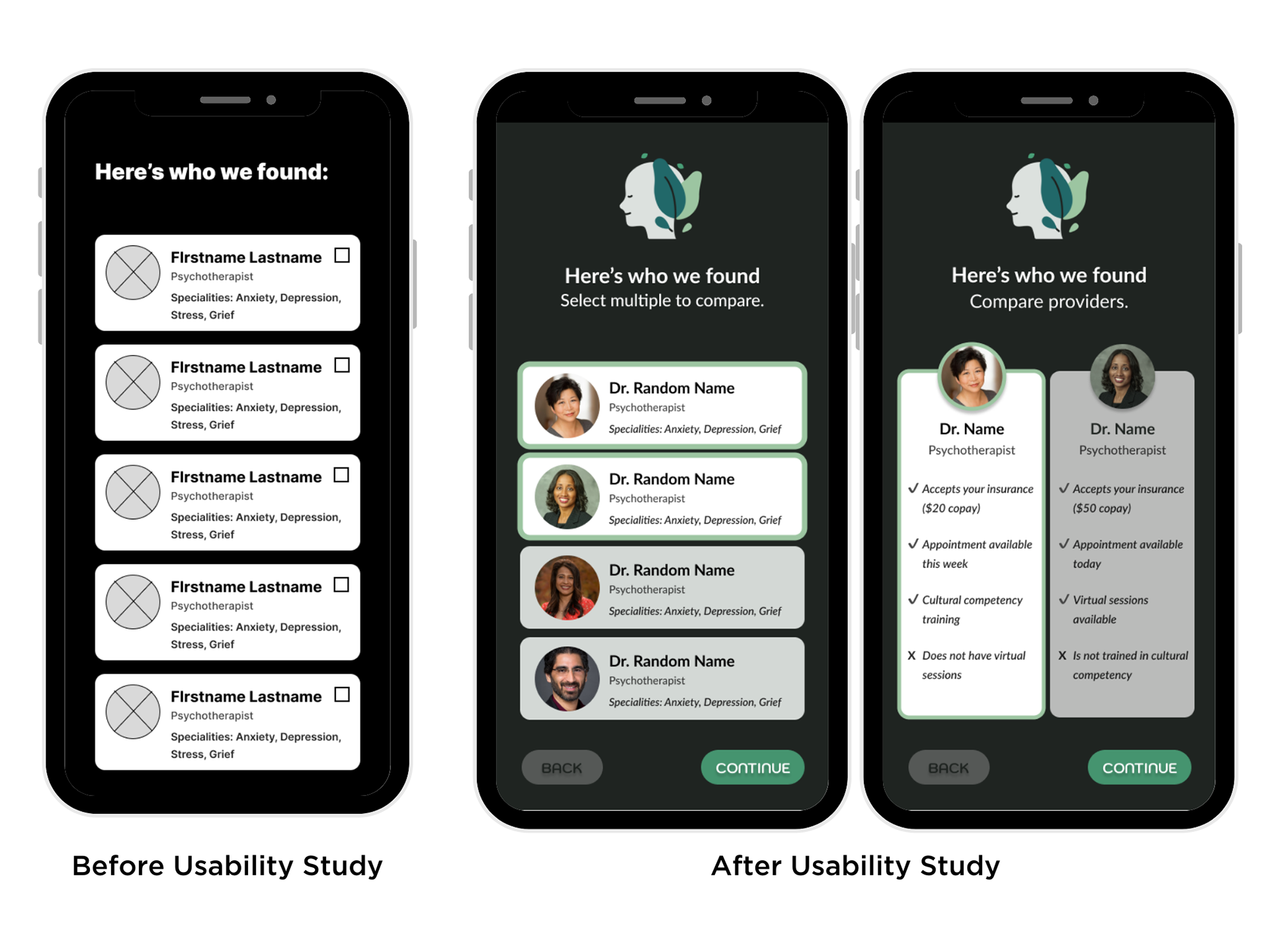
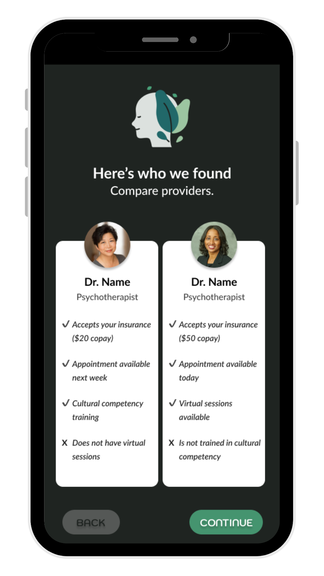
Based on the theme that: most users wanted a way to compare different services/providers side by side, an insight is: users need a comparison tool.
Priority 2
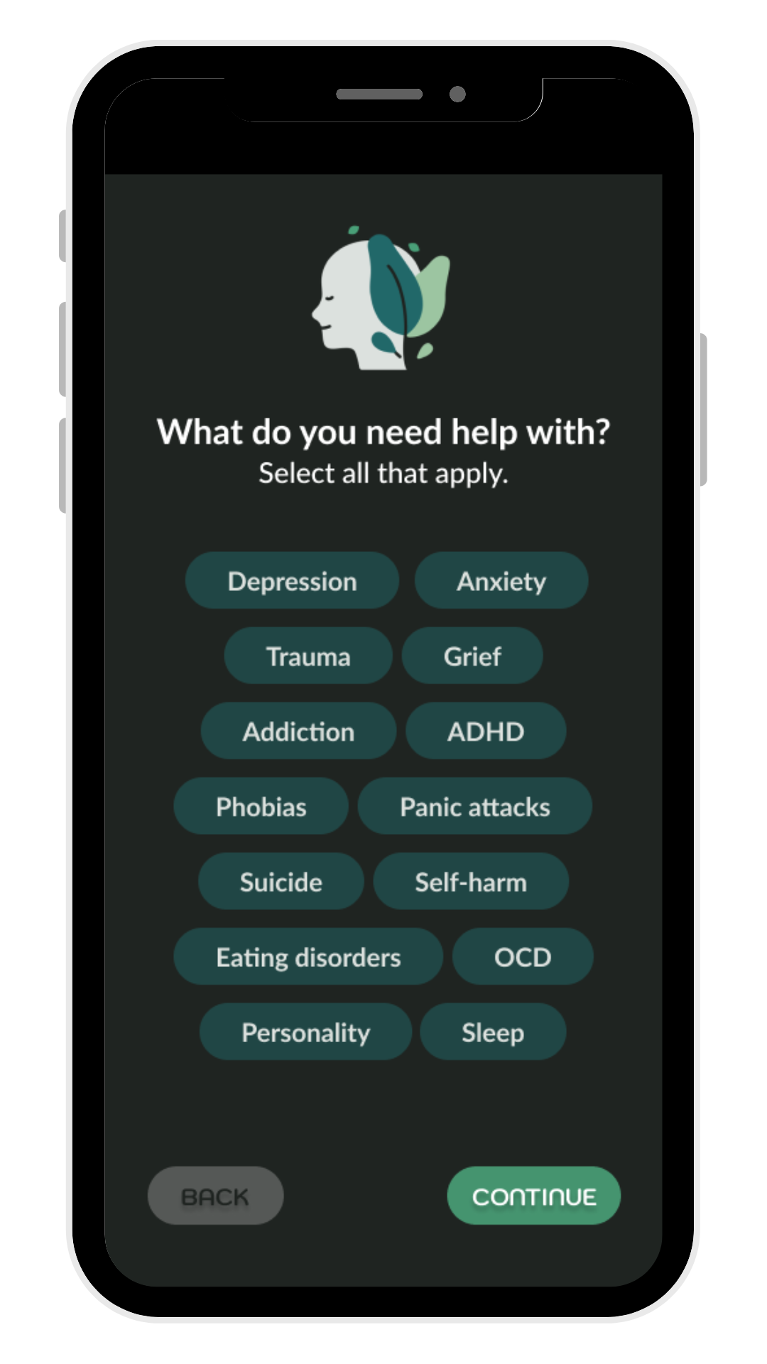
Based on the theme that: the simple questionnaire helped users to narrow down options, an insight is: additional filtering and drill down options would be helpful for users.
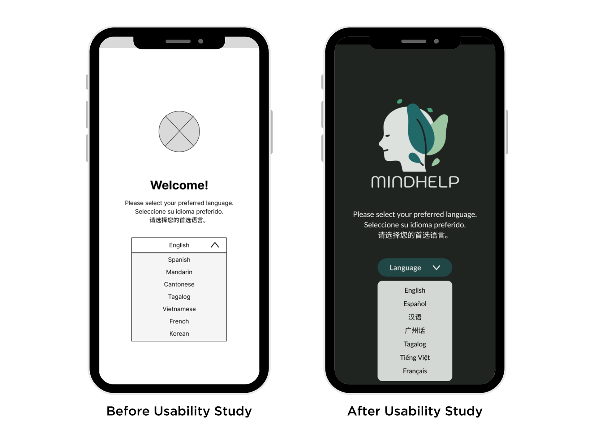
An important consideration was that if the aim was accessibility, writing all the names of the languages in English kind of defeated the whole point. In the high-fidelity prototype, each language name was written in that language.
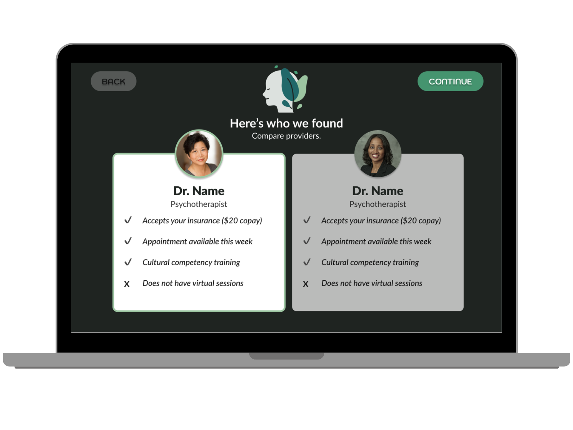
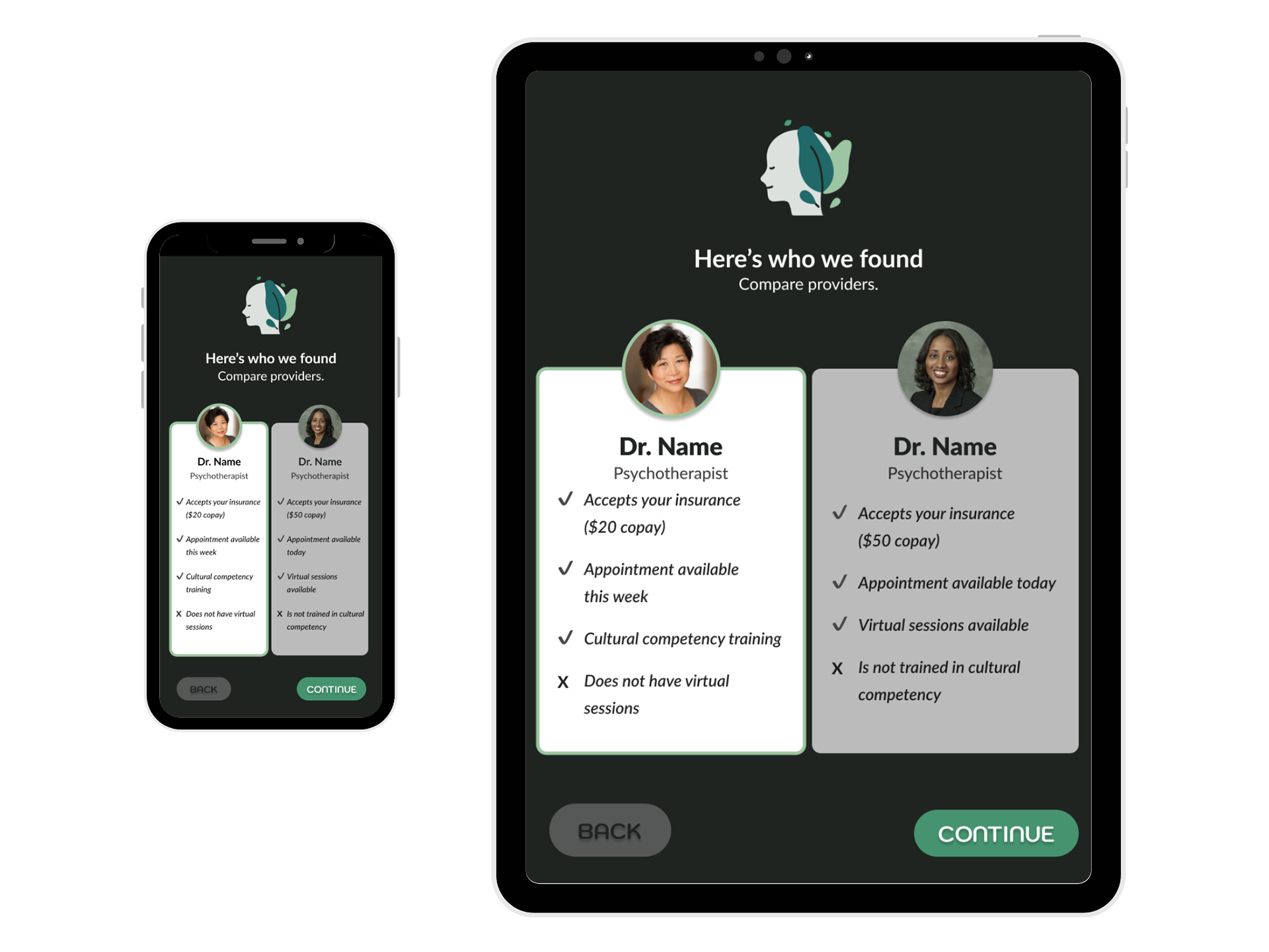
The usability study showed that an intuitive way to visually compare and contrast two providers would help make choosing one and booking an appointment easier and the user more confident.
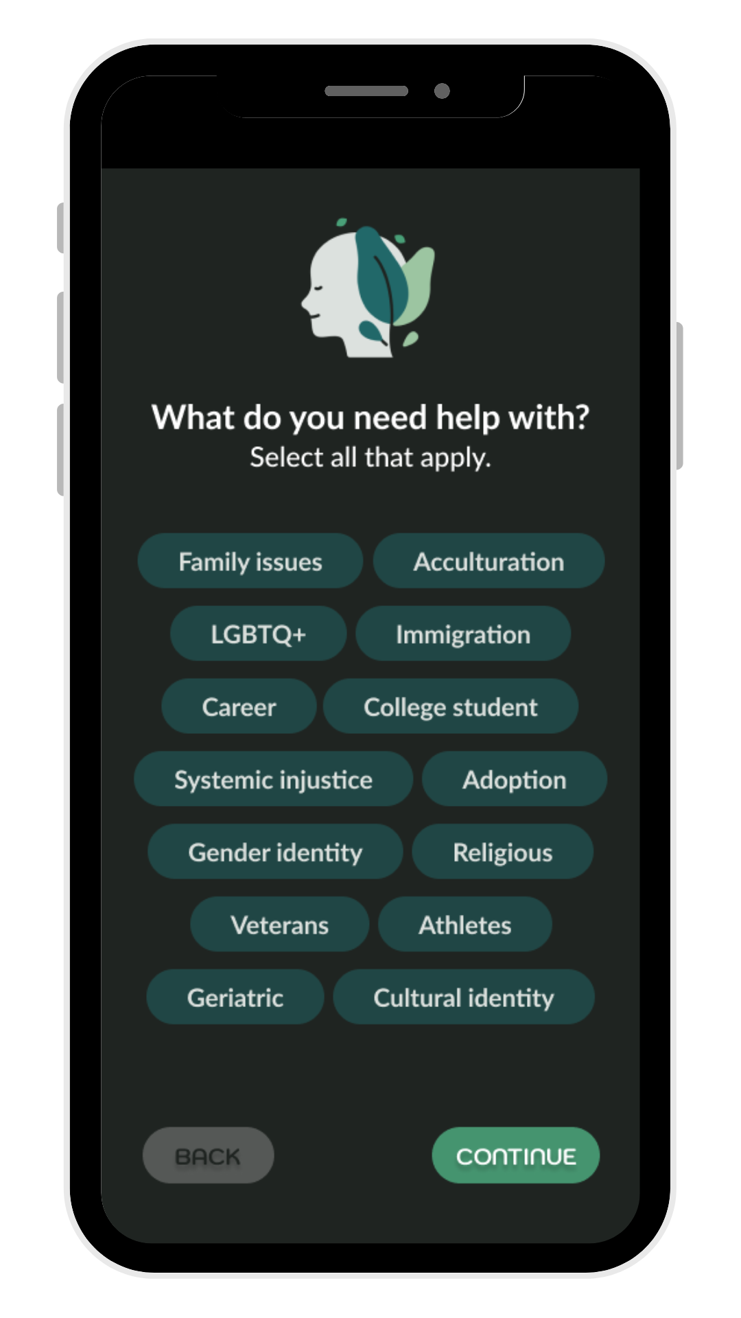
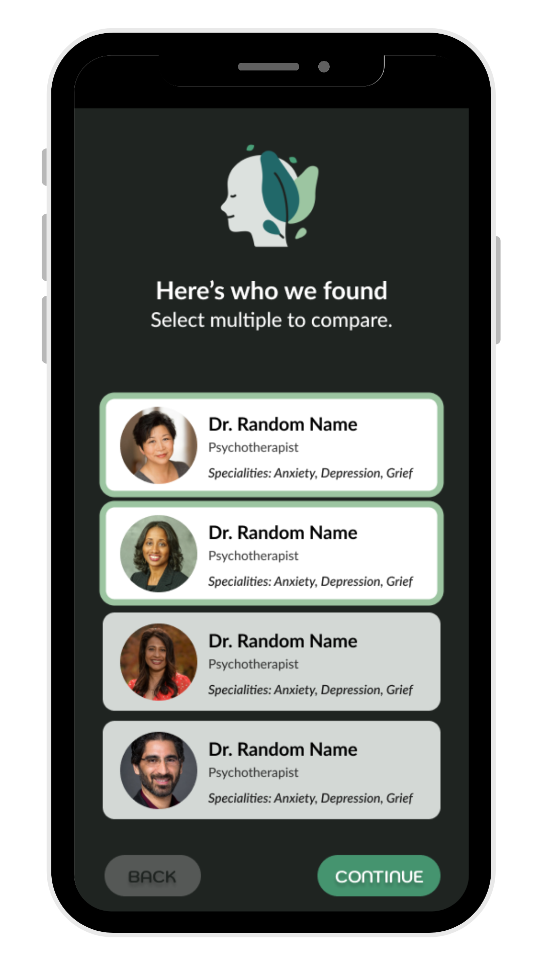
HIGH-FIDELITY PROTOTYPES
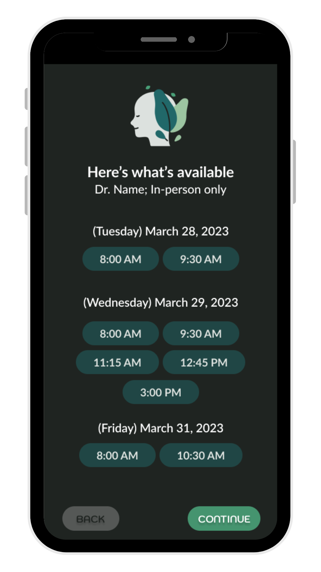
The final high-fidelity prototype presented cleaner user flows for answering simple questions about the user's needs (in this flow, to make a therapy appointment), selecting two providers from a match list, comparing them, and booking an appointment with one of them.

In consideration that immigrants could have variable access to a certain type of device, I designed screens for cell phones, tablets, and laptops.
GOING FORWARD
IMPACT
The website allows first-generation immigrant users to be connected with mental health care and resources.
One quote from usability study feedback:
“Finding a new doctor or therapist is always so stressful, even more so when you don't speak the language or don't have the community you're used to to lean on. This could really help people by making the process straightforward and stress-free.”
“Finding a new doctor or therapist is always so stressful, even more so when you don't speak the language or don't have the community you're used to to lean on. This could really help people by making the process straightforward and stress-free.”


NEXT STEPS
1. Conduct another round of usability studies to validate whether the pain points users experienced have been effectively addressed.
2. Conduct more user research to determine any new areas of need.
3. Translate the copy into other languages, ensuring the translations are culturally-sensitive and accurate.